
Using the DWeb brand
The DWeb visual world is built on three pillars:
- The personality that defined the design direction,
- A legacy that gave us the core components of the visual language, and
- Scale that continues to keep us from designing something ultra-finished or choosing too narrow a style.
The DWeb brand reflects the personality of the community. It's friendly and open-minded. It's dynamic and vibrant. It's the feeling that we are part of a bigger puzzle. It's a commitment to always put people over technology.
We wanted to reflect those characteristics in our design to make the movement (and the community brand) more human and more welcoming, and attract those who share our values.
Built for and by the community, we've built this as an open and adaptable brand. We want it to evolve as the decentralization movement grows.
Feel free to use all the available assets today, but we ask that you please follow the guidelines below. This will help the community build a consistent visual image worldwide.
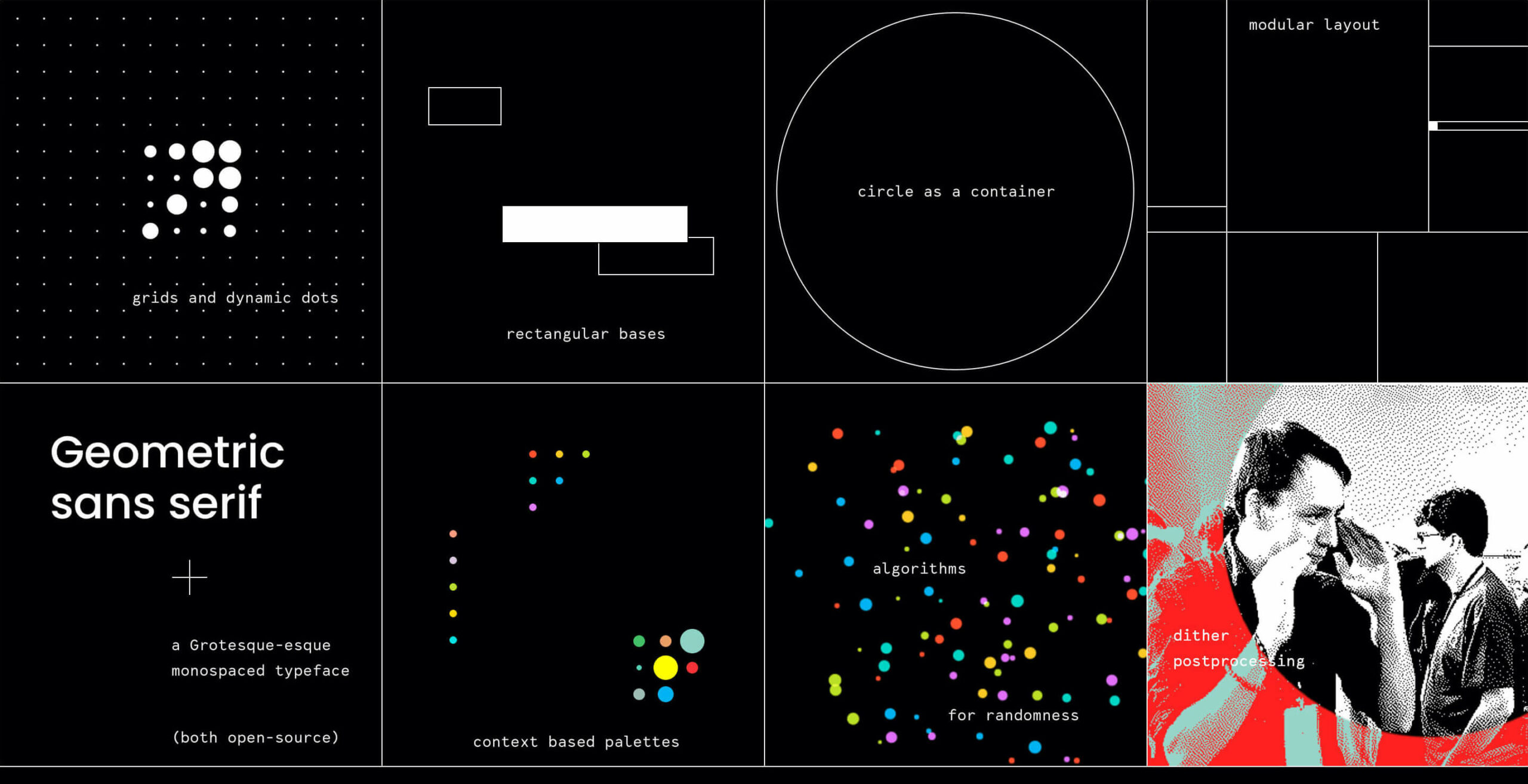
The varying size of dots depicts the many people building the decentralized Web. They are living and moving. Small dots can become bigger over time. Yet because we're one community, the dots form to reveal the capital letter D.
Here are a few ways to treat the DWeb logo with respect:
- Allow enough clearspace on all sides of the logo. The minimum clear space equals the double distance between dots on the logo grid.
- Place the logo on a non-busy area within an image. Use white/black versions of the logo when placing it on a photo background.
- Use high contrast color combinations for logo dots and the background.
- Use our logo and DWeb Principles graphics (see below) to show your support.
And here are a few logo crimes to avoid:
- Use outlined dots on the logo.
- Place the color version of the logo on a busy or light area within a photo, making it hard to see.
- Apply color on the rectangular label “Web” in the logo. It should always be in white outline (primary lookup on the dark background) or filled white/black on color backgrounds.
- Modify the logo shape in an excessive way. For example, don't add more dots, create a new letter, or replace dots with other shapes.
Colors
DWeb has three color palettes that balance the vibrance of the community with the beauty of code.
UI color palette
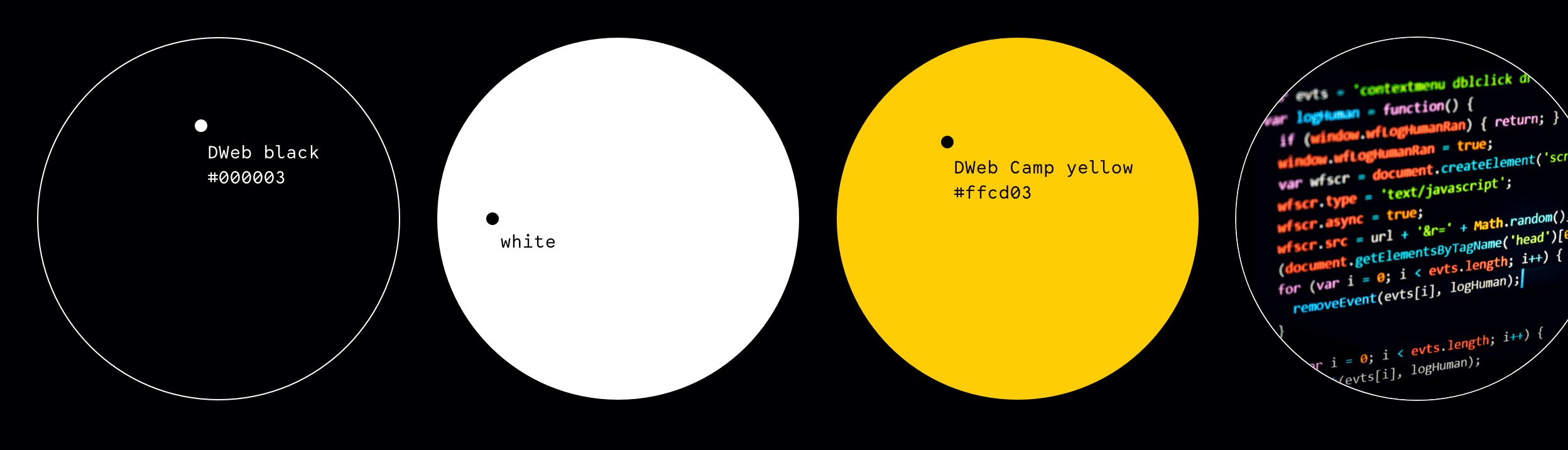
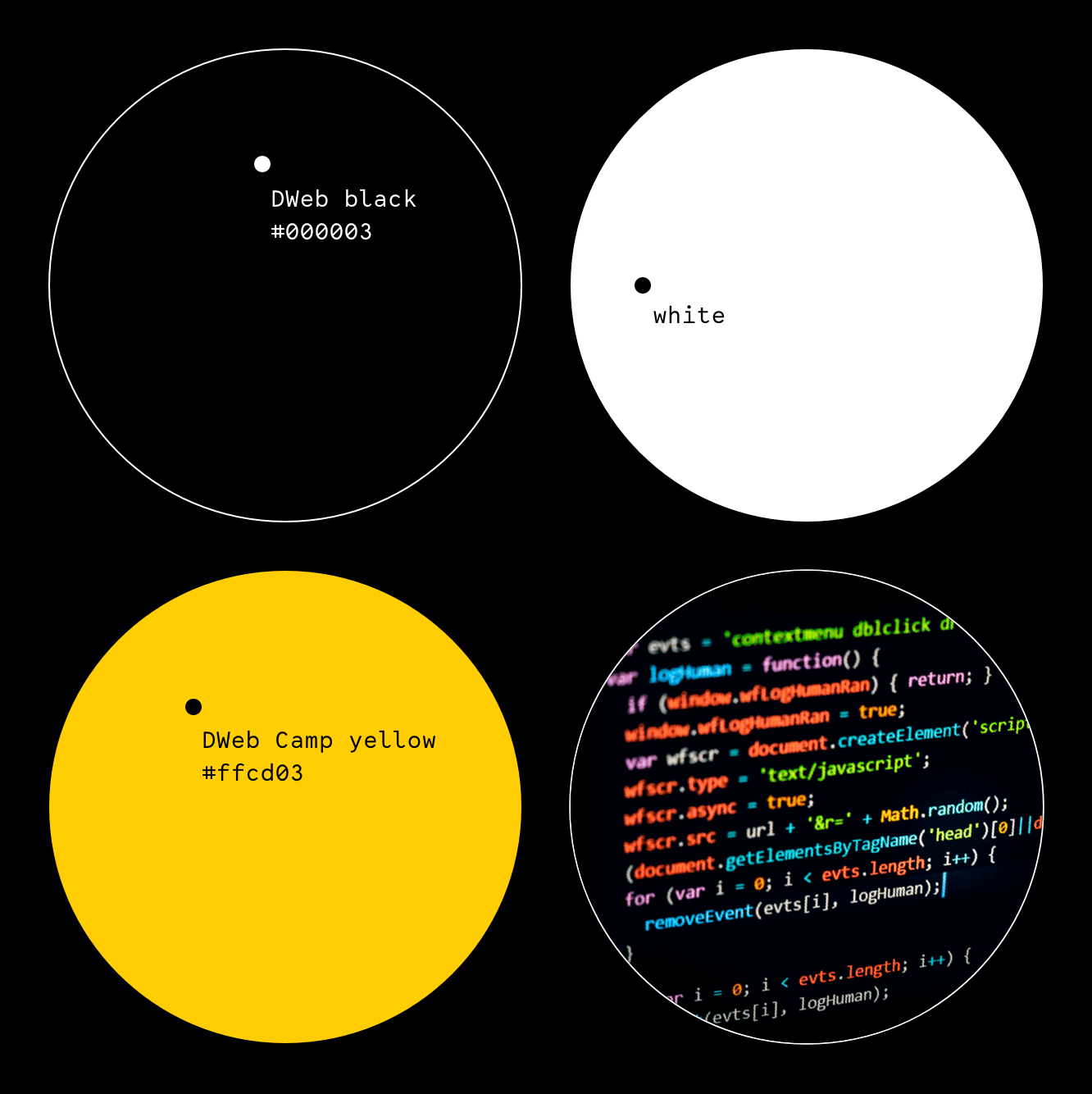
We sought to make our content more legible for people with color blindness or lower contrast sensitivity. That's why we use black (000003) and white as our main color palette, for both brand communication and user interface design.
Those who joined us for DWeb Camp in 2019 may remember the warm sunny yellow color that we used for all our published materials. That yellow became the main color for user interface interactions. We call it the Camp Yellow (ffcd03).
Logo colors
The colors of the DWeb logo draw inspiration from the colorfulness of written code: bbe022, ff4f2c, 00d6c6, fcc924, e16ef9 and 00b3f1. These colors are also used in the animated dots on the DWeb website.
Node color pairs
Each node has their own color too: one primary color (for labels and hashtags in UI), and one secondary color which we use for color overlays on the photography.
One of the core elements of the DWeb visual language is the Atkinson dithering effect that we apply to the majority of photos. We use black and white presets, adding a gradient map or a flat overlay on top of the processed image.
Typography
We use the font Lab Mono for almost everything brand-related — from body text on this website to meet-up details on the event graphics. Lab Mono is a monospace typeface designed by Martin Wecke. It is available in one style - Regular.
Poppins Medium is used for display-type treatments — so we use it as a headline font (H1, H2, and H3) or for where our message should be loud and attention-grabbing. Please, do not use any other styles but Poppins Medium for the DWeb brand-related design materials.
Both typefaces are open-source. Download Poppins Medium on Google Fonts and Lab Mono on Github.
All the DWeb Nodes are different from each other and bring in their own local vibes into every meetup their host. Because of this, every Node has its own style under the overarching visual identity of DWeb.
About requesting the media kit. What to do and how to share. Something else to add as a link.
We will open-source the brand to the DWeb community in early 2022. If you want to contribute and be a part of the launch, message Iryna. Or follow our team on Figma and get design-in-progress updates.